When it comes to painting and modeling, its often the little touches of
creativity that can really make a piece stand out. A great looking game
layout is all the more enjoyable to play on and can make the experience that
much more engaging. A little unexpected touch of style can make your figure
jump out from the crowd. Verdigris is one of those techniques I think every
painter ought to have in their bag of tricks for just those reasons. It may
not be one youll use all the time, but when you have the call for it, I
think you'll be glad that you can deliver.
As with most painting techniques, it helps to have a good idea of what
youre trying to represent when you set out to figure out how to do it.
Verdigris is the common name for the chemical compounds formed when
copper, brass, or bronze are exposed to air, water, and other trace elements
therein, resulting in copper acetate [Cu2(OAc)4 ], copper chloride
[CuCl2], and copper carbonate [ CuCO3]. It is the blue-green you see on an
old oxidized penny, old wiring, and old statues in the park. The name in
fact comes from the Old French `vertegrez`, or `the green of Greece`, due to the
preponderance of the substance on ancient Greek artifacts. Although it is
most commonly seen in variations of blue-green, depending on the chemicals
which have been present it can in fact vary quite a bit from dark blues
to bright greens and even yellows and white at various stages of exposure.

In this article I'll demonstrate a couple of recipes and techniques that are
quite easy to get the hang of and can be used to great effect. I'm no expert
on the technique, but I have spent some time working with it, so hopefully
my groundwork will be a helpful base for taking off and running with it in
your own projects.
For these examples I'm using some old Reiksguard Knights from Citadel. They
are a good choice to use as statues, and they offer quite a bit of
topographic variety so you can see how the effect works on various surfaces.
All three are primed black to start. The first two examples will both begin
with bronze. My metals start with TinBitz (GW), Burnished Bronze (VMC) and a
little Burnished Brass(GW) to brighten them up. That just happens to be a
recipe I enjoy for a bronze that is both rich and bright, whatever your
favorite starting place for these metals is will be fine.

Method 1: Verdigris in a bottle.
There are bottled formulas out there from a variety of manufacturers
for all sorts of effects, including verdigris. I've chosen Verdigris Glaze
(VMC932) for this as I'm sure the brand is familiar to most readers.
The first thing to mention about Vallejo's verdigris is it is a glaze- not in
the thin almost ink-wash sense that painters generally use for that term,
but in the sense of a glazed doughnut. It has a thick consistency and milky
complexion out of the bottle. You'll want to water it down on your palette so
you can get it where you want it. Unless you're doing a piece where the
oxidation has taken over everywhere, this is going to be in cracks and
crevices where water might pool, and on surfaces bounded by lips and edges
where moisture may be held on by surface tension.

Although it is a light blue color at first, this can be deceiving. As you
apply the glaze, especially thinned to a usable consistency, you will see
that it dries in a more chalky white shade.
With only one application you get this:

There is not much to see at this point. There are two approaches with
Vallejos glaze: Lots of thin coats, or fewer thicker ones. You certainly get
more noticeable results if you glob it on there, but its harder to control.
Here you see the figure progressing with additional coats:

As you can see, the result is a little less than stunning. Ive seen other
tutorials where people make moderately good use of this product, but to
really finish it, they almost always end up with normal pigments.
This last image, taken under proper lighting, is about as good as it gets
in my experience:

Hopefully this will save you from bothering with additional products you
dont need when you already probably have what you need to make the same
thing, only much better.
Method #2: Home Brew
For this method you need at least a good teal green, and a turquoise, and
white. I used Turquoise (VMC 966) and Emerald (VMC838). You can achieve
similar results with Electric Blue (VGC 23) and Jade Green (VGC 26).
Using various ratios of the blue and green gets you a variety of finished
looks. I find that the blue color tends to give you the most body and
coverage where as more green in the mix tends to make the effect pop more,
so I tend to start with a bluer mixture and move the mix in favor of the
greens as I work up the effect.
To start with you once again want to hit at least the cracks and crevices
with a good wash. This one is about 65/35 in favor of the turquoise, and I'm
painting more nooks and crannies on one side, while hitting the larger
surfaces on the other for comparison:

A few more coats to build up the wash. As I progress not only do I hit
smaller areas, and shift the color a little more toward the Emerald, I also
dont thin the wash quite as much, so you start getting more opaque coverage
once you have the tinting down where you want it:

Once you are happy with the locations of your oxidation, you should stop
washing, and start a more painterly technique. Verdigris frequently happens
in localized bursts. A pock mark or scratch or surface artifact may be the
first place the reaction starts to occur, so playing to that organic looking
development helps the effect look realistic. Remember you're representing a
process that the metal is undergoing. Some places will be farther along than
others at any given time. You can vary the effect here by adding a bit more
white as you go to brighten the color if you want a more intense verdigris.
Here I've started to use a heavier hand to get mottled splotches, and I have
also added some linear drippy bits to echo surface irregularities that may
be channeling rainwater over time:

Now it's time to really start adding in white and get some highlighting
going. At this point you're trying to both replicate the chemical patina, and
to represent the object in 3D, so you should hit the edges of the more
opaquely colored areas with more white in the mix, and the centers of linear
or circular splotches and drips:

Now that you have a really solid and intense light blue verdigris, it is time
to bring the green back in a few places to really make things pop out. Here,
I'm back to a slightly thinner and more Emerald heavy mix. Just enough to
tint over the few the places that I hit with the white, and leaving some
nice green splotches over some of the blues:

The last step is to bring selected parts back down a notch and give the
whole thing a bit of weathering. Objects with verdigris are almost always
old and weather-beaten and a realistic piece will reflect this. A little
thinned down TinBitz, or brown inks, can work well for this. At this stage
I used thinned black to do some mottling, which gives a good suggestion
of tarnish, grime, and shadows, and then applied a somewhat liberal washing
of Smoke(VMC939) in many of the crevices:

Here are a few different angles of the finished statue under proper
lighting:

The third example was created with the home brew method above, but over
copper. This is another Reiksguard Knight, primed black, and given his
initial metallic finish with Coppery Orange (RMS) over a base of Hammered
Copper (VGC59):

Start as before with a couple of washes of the Emerald & Turquoise mix:
The process is going to be the same basic recipe as before, but I include in
the in-progress shots along the way in the hope that it might be of some use
to see how I've built up the colors.
At this point the base washes have given a good foundation, and now I'm
working at really building up the color. It is at this stage that you want to
decide if you want to go more blue or green and work accordingly. I'm going
to get a lot of bright oxidation on this one, drifting into brighter greens
at the end, so I use a lot of Emerald and White, and a bit less blue than
on the bronze example:

Once the base colors are nice and built up, it is time to move on to highlighting.
Again, it helps to work with the shape of the miniature and to keep in mind
where, on an exposed statue, there might be oxidation. Pick some areas and
work them up with lighter mottling and spotting, drips, and attention to 3
dimensional lighting where appropriate. From this point on it is worth
mentioning that a selectively heavier hand can help the overall effect. We're
generally conditioned to not want to obscure detail or have the paint we
apply show visible layering. If you take a look at a variety of examples of
corroding metal however, you will see that the process of oxidation can have very
physical effects- pitting, powdering, flaking, etc, not solely a change in
color . . . so getting a little thick here and there can be a good thing.

Since I'm doing this example more into the green range, the highlights on the
greener areas are with made with a mixture of Emerald, White, and Sunblast
Yellow (VGC6), and follow the same pattern of hitting increasingly smaller
areas, using little spots and a slightly thicker application in parts to
suggest the powdering and crumbling at the most active areas of the process:

Lastly, I've gone back to tame things down again and add some age, tarnish,
and rot with black stippling and some Smoke. This is another time where your
time-honed techniques can successfully be abandoned- letting the washes pool
a little bit can have a very effective result in suggesting different areas
of the metal at varying stages of decay.
The final result with shading and proper lighting:

After a little practice you may find you like the technique and you have some great blue-green recipes going, but you find the process too time
consuming. One way to take few steps out is to return to the beginning of
this article, and the Verdigris Glaze I derided as not very impressive. Its
milky white consistency actually works very well for laying down a quick
opaque base where you want it, which you can then start applying the heavier
color layers on without using your pigments for as much washing. I dont
find the effect vastly different, just a touch weaker ; you have to work a
little harder to get a really intense bright verdigris with the glaze as a
base.
As mentioned at the beginning of the article, this is sort of a niche
technique, not something you're likely to use too often. It can really give
life and a unique touch of realism to your projects when used in the right
places.
Statues, gargoyles, and sculptural elements are a great place to use it for
a quick bit of gaming terrain:

You can find many places to try it out in Victorian Sci-Fi & Steampunk
settings on boilers, rivets, giant robots, and what not. Many mechanical
devices and industrial fittings can benefit from a bit of cultivated
neglect- cleats and hardware on a decrepit pirate ship; sextants,
astrolabes, spyglasses and associated scientific minutiae in the lab of a
mad scientist or hermitic mystic, etc. And what RPG dungeon crawl would be
complete with out a set of dubious aging kit lying around? Is it magical?
Is it cursed? Pick it up and find out!

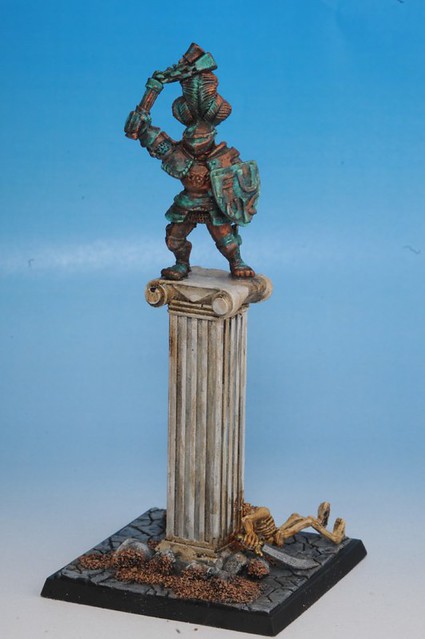
Update- April 2010.
I have gone back and dug up the original Reiksguard knights I used for this article and made them into complete terrain pieces for use in a game at Salute'10:
The pillars were sourced from the fine folks at Fenris Games. Give them a shout for all your scenic accessory needs. :)
Hopefully the above examples and recipes will help you to flesh out your own
projects, or possibly inspire you to tackle some new ones.
Paint reference:
- VMC: Vallejo Model Color
- VGC: Vallejo Game Color
- RMS: Reaper Master Series
- GW: Games Workshop
|